


Colour for marking physical hazards: SAA Industrial Safety Colour Code
Appropriate signage is a critical component of controlling risks within the workplace, with colour playing a significant role in the identification of hazards.
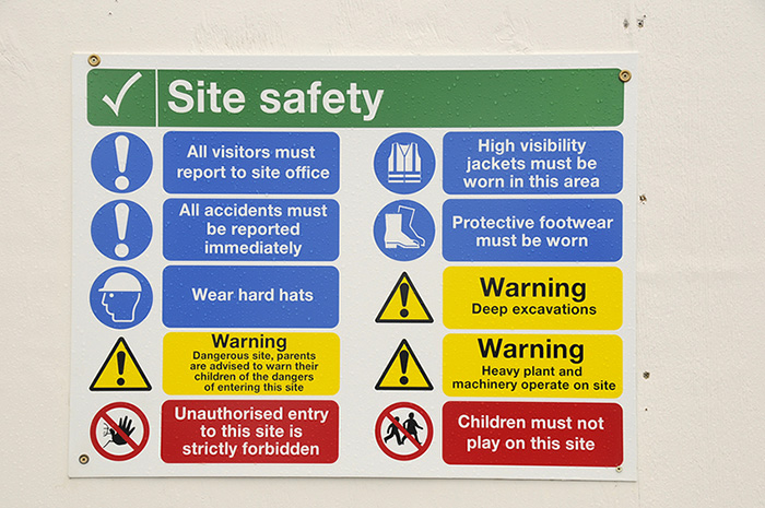
The AS 1318-1985 SAA Industrial Safety Colour Code defines the use of red, yellow, green and blue for marking physical hazards and locating particular equipment.
Defining the use of colours is most important in producing consistency across workplaces, thus creating an expectation of their use for workers.
However colours can also have a psychological and behavioural influence on people, making some colours more suited to particular uses than others.
Red:
According to the Safety Colour Code, red should be used to indicate danger, locate fire fighting equipment and identify stop buttons and emergency stop controls.
White lettering, stripes or edging may be added, however red should be the basic or background colour on the sign.
Red and danger:
A 2009 study found that red was associated with failure and negative words, while a 2014 study found a strong link between the colour red and an implicit association with danger.
Another research team studied the effect of red in achievement contexts, finding that it impaired performance and prompted avoidance motivation instead.
In other words, the colour led people to make choices based on avoiding the possibility of failure or negative consequences, making it an excellent choice for signs warning of danger.
Yellow:
Yellow, either alone or with black markings, is used to highlight locations where caution should be used, or where radiation hazards exist.
Yellow and caution:
In darkness, yellow is the most visible colour from a distance and the second most visible colour during the day, after green.
Shades of yellow are the least pleasant colours to the eye, whether it is the straight colour or green-yellow/red-yellow variations.
Additionally, green-yellow prompts the most physiological stimulation, as well as the strongest dominance feelings, alongside straight yellow.
And while red-green colour-blindness is relatively common, particularly amongst men, blue-yellow colour-blindness is extremely rare.
Given yellow and its various offshoots can be stressful and an eyesore, as well as visible to the majority of people without trouble, it’s a logical choice to denote areas where heightened alertness and caution are necessary.
Green:
Green, used with white, indicates the location of safety and first aid equipment, except for fire fighting equipment.
Green and well-being:
As well as being highly visible, green is also associated with success words and a calming effect, with green and blue rooms found to be less anxiety-provoking than red and yellow rooms in a healthcare setting.
Green has been linked with medicine for the last century, beginning with an American surgeon, who created a green operating theatre in 1914 to take advantage of its contrast with red, allowing him to view the texture and details of wounds more easily.
Around the same time, “colour therapy” also introduced green to hospitals, associating it with rest and contentment. In the years that followed, various architects and administrators advocated for the use of green in medical settings until it became a major symbol of hospitals.
Given its historically strong association with well-being and healthcare, green signage for safety and first aid equipment is not a surprising choice.
Blue:
Blue is used as the base or background colour in signage that denotes mandatory instructions to be followed, or information of a general nature. Lettering must be in white.
Blue and trustworthiness:
Blue is commonly used in the corporate world in logos and branding, and is perceived as dependable, high-quality and trustworthy.
Blue light has also been shown to increase alertness and performance in attention-based tasks, while blue rooms reduced anxiety in hospitals.
Consequently, when used in signage, many people might have an instinctive trust or confidence in the information or instructions being conveyed.
While colours have been shown in research to result in particular psychological or behavioural responses, individuals may still have different responses based on their own backgrounds.
As a result, other countries may choose to use different colours for different signage uses based on their own cultural perceptions.